Using the first-hand experiences of others is one of the most effective ways of deciding whether or not a particular dating service is right for you. That said, Consumer-Rankings recently opened up our site to real people who have used some of the most popular dating sites out there. In a series designed to give readers an authentic look into how certain dating services work, our guests wrote journal entries for each day they logged onto the sites over the course of a week. Check out the first post by Los Angeles native, J. Fergus below as she tests out premier dating website, Match.com, for the first time.
******
Guest: J. Fergus
Summer’s ending, but I’ve yet to have the required sex-filled fling. Once the days and nights get cooler, I know that people will be starting to pair off so they can keep each other warm. Since I didn’t want to be the last girl out in the cold and most of the single men I know are pretty dim, I turned to Match.com
Sept. 16th, 2014
As typical for most dating sites, I’m drawn into Match with the prospect of a free singles search, but after entering my information, I’m gently coaxed into registering. It’s an age-old dating website maneuver, but Match’s industry topping reputation was enough to reel me in. I can always tell which sites help you find love and which are geared towards hook-ups by asking if you’re “single” or “never married.” After selecting the latter, I went on to answer a few questions about myself. I enjoyed the option to further describe certain things like my job and ethnicity after choosing from a basic list.
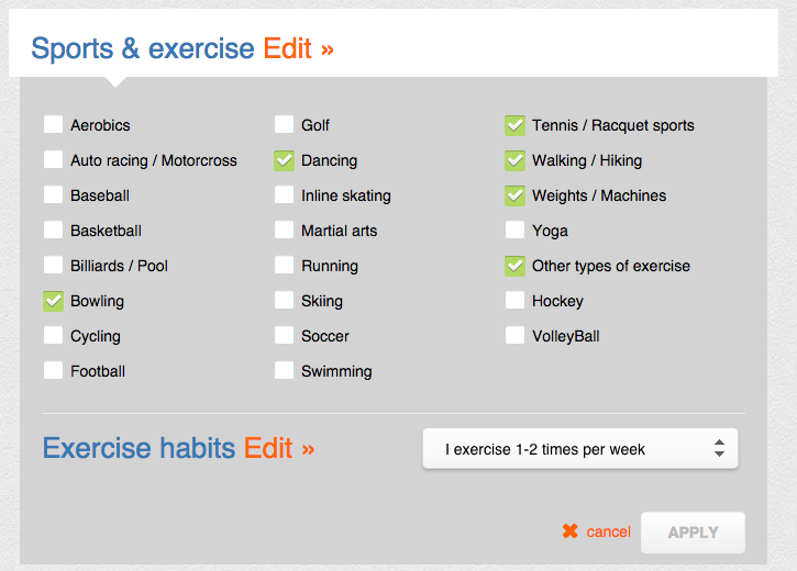
“What types of sports and exercise do you like?”
Gutter mental note: Let’s see how long it takes for someone to make a suggestive comment about what “other types of exercise” I might enjoy.
Match definitely takes the guesswork out of describing yourself by supplying hobbies. I wish I had this kind of assistance on job interviews. In the “About Him” section, a side panel advised me to not be too picky, but Match does everything in its power to help you seek a very specific mate. There’s a “Deal Breaker” option for every desired trait section except for salary, spoken languages, height, hair and eye color. Maybe a little shallow in certain respects, but I’m sure it helps narrow down the selection.
Figuring that honesty is the best policy, I let my headline read “Femme fatale in SoCal” because I like people to know that I’m dangerous, but not so unapproachable that I don’t rhyme. My own fear of commitment guided me to the one-month plan. The bundled six month plan has the “Match guarantee” that if you don’t find someone in six months, you get an additional six months for free. This is cool because you basically save money if things don’t work out that soon.
I finally submitted my profile for approval at 2:48 p.m. Match said it would be reviewed within 24 hours, but mine was rubber-stamped within 24 minutes! At first glance of my profile, I was a little peeved the site hadn’t automatically determined my astrological sign, but upon editing that section of my profile I was pleased to see that you can state your disbelief in astrology or choose to keep your sign hidden.
Finally, I checked out my first dozen matches, half of whom were wearing sunglasses, but I guess that’s just a caveat of online dating in Southern California.
Sept. 17th, 2014
I decided to poke around the mobile app to determine if love could find me on the go. In addition to my daily matches, there’s a virtual stack of photos I could swipe through looking for romance. Unlike a lot of apps that force you to commit to a rating before you can find out more information about the person behind the picture, Match let me click through to their profiles. It’s an important feature because even felons and stamp collectors can craft an attractive profile photo. The photos themselves aren’t the best quality at first, but they become clearer when viewing individual profiles.
The most surprising part of the app is the lengthy filter section in the search. Match.com is definitely committed to letting you be as picky as you want, no matter where you are. I do wish search options were a little more queer friendly (i.e. allowing me to search for both sexes rather than one at a time), but it is handy specifying ideal heights and other arbitrary attributes.
I’m eager to dig into the communication features. Your profile can be viewed and favorited, you can be emailed or winked at, and your pictures can be liked. While deciphering how I feel about these interactions, I’ve used winks the most so far. I did respond to the rather wordy message, “Hi beautiful,” from an exercise junkie in the Bay area, but I’m not rushing to mail the wedding invitations just yet.
Sept. 18th, 2014
Match’s mobile app updated today and my new match photos were noticeably clearer. While choosing which men from my daily matches or searches I wanted to talk to, I realized this was an additional way to communicate. Approving a match sends a notification to the other user about your interest in them. So far, I’ve determined that this act lies somewhere between a wink and a favorite.
An actor in Los Angeles “sparked my interest,” so Match nudged me towards sending him a message. The encouragement to reach out more to someone I liked might have made me second guess my decision, but, in the case of this attractive and potentially narcissistic guy, the suggestion was all I needed to ask him how his week went. I look forward to being invited to an improv show.
Sept. 19th, 2014
I piqued a few more gentlemen’s interest overnight, most of whom did not have profile pictures. I clicked through anyway to determine who was hiding and why. One user was the first person to make me want to click the “view more” link on his profile out of actual intrigue. His entire self-description was a story relating Scotland’s potential independence to a piece of KFC chicken that looked like Great Britain. I appreciate when someone shows me that they’re funny and well-read instead of just typing it.
Since I found a profile I enjoyed, I finally used the “find more like him” feature which led me to more older men. A few men amused me, but it was hard to beat the wit I had just left behind. I shot him an email saying how much I loved his profile and I’m genuinely hoping he responds with the sequel.
Sept. 20th, 2014
An engineer in his mid-thirties emailed me today saying he’d “love to know me.” Not one to shy away from ambitious people, I’ve been emailing back and forth with him while I’m out and about. He quickly asked me for my number which seemed unnecessary since we were both using the mobile app. It’s a little disheartening not being favorited by my first weekend on Match, but, given the various other ways men have chosen to connect with me, I can’t really complain. Favoriting seems like a tool for bookmarking someone you don’t have time to talk to so you can flirt at a later date. I’ll admit that I haven’t even favorited anyone yet because it makes much more sense to email or wink at them.
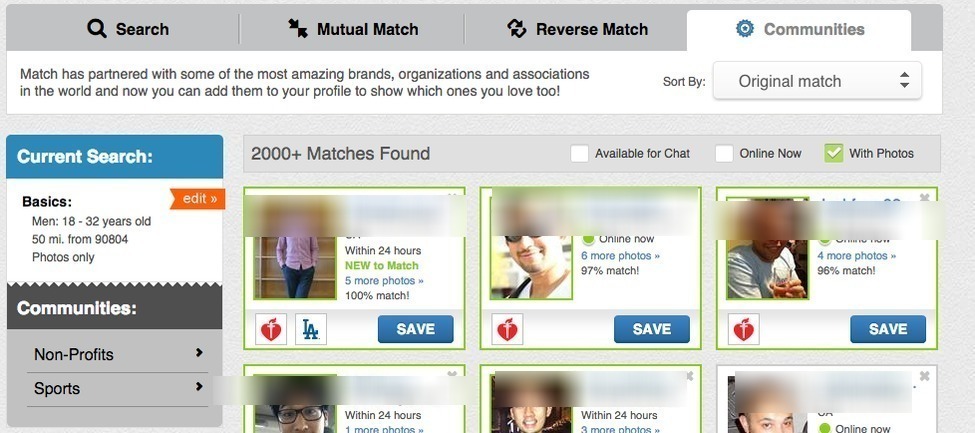
I tried out the various other forms of match searching to see how big the difference was. Searching through the “Mutual Match” master filter probably resulted in the lowest amount of matches simply because our preferences had to align perfectly. “Reverse Match” was my favorite filter because I’m not extremely picky. I’d rather see who is interested in the attributes I have and start communicating with a leg up. The “Communities” section is a little lackluster due to its two possible communities: non-profits and sports. The feature is pretty new, so I could see it being more useful as communities are added.
Sept. 21st, 2014
Budding romance always seems to take a breather on Sundays. I think Sundays are meant for people already in relationships, brunch aficionados, and serial picnic goers. Since I don’t fall into any of these categories, I spent my leisure time winking at and favoriting Match members. The slow vibe of this Sunday got me to check out some of the features I’ve been neglecting. I’m a little embarrassed to have only realized today that the “Connections” page and the home page are the same thing. Match chose the right tab to make the home page because the amount of information available on it never gave me a reason to click on the “Connections” tab.
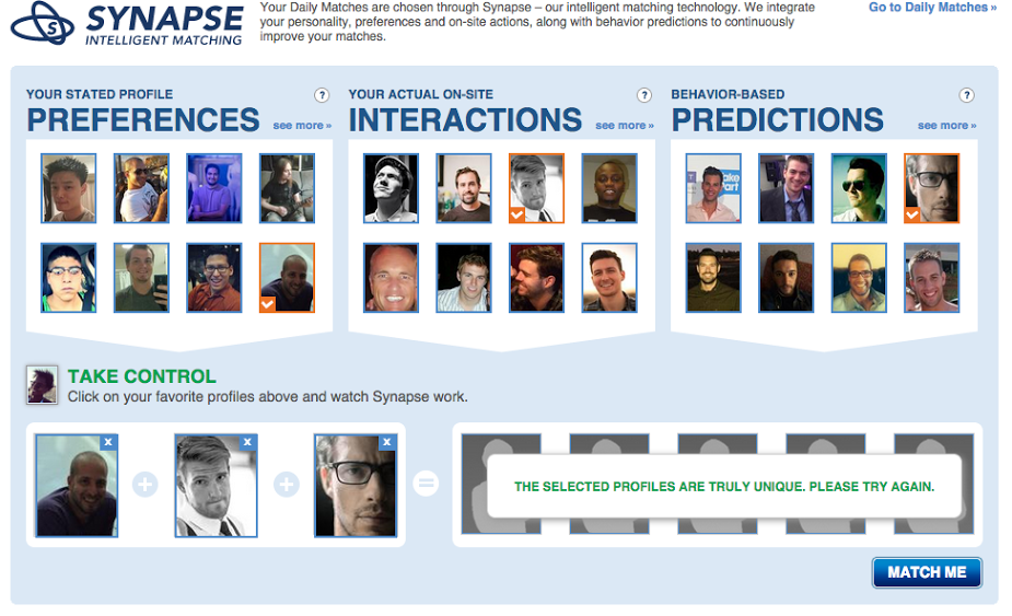
Synapse is yet another feature that puts me in driver’s seat of my match selection. It’s pretty rare for a dating site to show you what information goes into their matching algorithm. I chose a man from the three categories they presented: my stated profile preferences, on-site interactions, and behavior based predictions. I’ve been showing this screen-cap to all of my friends to prove that I really don’t have a type.
Sept. 22nd, 2014
I felt pretty special signing in today and seeing all the various notifications I had. Originally, I thought so many different types of alerts were unnecessary, but I can see how they brighten up your “Connections” page. I think most dating websites rely on messages, views, and favorites, but the addition of photo likes, winks, and my daily matches makes it feel as though I’m constantly working towards establishing connections with people.
I mostly enjoyed that photo likes are in their own category so I can see who simply likes my beach photo and not necessarily my full profile. Case in point: one of my “likes” from yesterday returned the favor and also left a message. He said, “Thank you very much. You are a beautiful lady.” I will say that I seem to be gradually finding my way out of the land of the fitness obsessed sunglass wearers. I can’t wait to see what new matches come my way as I put more information and time into the process.
Things I loved:
- The numerous different ways I could interact with other users’ profiles.
- The daily matches that took the effort out of searching for interesting users.
- The specific search functions–both on website and the mobile app.
- How quickly my initial and edited profile was approved.
- How the details put into profile creation, search options, and my communication with others showed Match’s genuine interest in getting you off the site and into a relationship.
Things I would change:
- I could create a profile for a gay male or a lesbian female, but not for queer-inclined person.
- The choice limitations in the “Communities” section of Match’s search.

