Using the first-hand experiences of others is one of the most effective ways of deciding whether or not a particular dating service is right for you. That said, Consumer-Rankings recently opened up our site to real people who have used some of the most popular dating sites out there. In a series designed to give readers an authentic look into how certain dating services work, our guests wrote journal entries for each day they logged onto the sites over the course of a week. Check out the latest post by realtionship writer,Simone Paget, as she tests out lauded dating site eHarmony for one week.
*****
Guest: Simone Paget
A few weekends ago, I was hanging out with a couple who are friends of a friend. When I asked them how they met, they immediately replied “eHarmony!” As one of the world’s largest online dating sites, it’s not unusual to meet people who have found romantic success with the site (after all, eHarmony has been responsible for over 600,000 weddings and counting)! So, I decided to jump at the opportunity to try the service for a month. Here’s what I found.
Day 1 –
One of the first things I noticed about the site is how stylish and modern it is. The sign-up process is also very straight forward.
Once you make the decision to sign up for eHarmony, the site will lead you through a series of prompts where you’ll enter basic info regarding your age, gender and location. eHarmony prides itself on being very relationship focused by only matching you with people with whom you’re deeply compatible with. Once you’ve input your basic information, you’ll then be prompted to complete the mandatory personality questionnaire. Unlike other dating sites that I’ve tried where the questionnaires are optional and to be completed later, the eHarmony questionnaire is front and center, and completed before you’re able to access the rest of the site. Although this may sound daunting, the site segues into the survey in a way that seems very straightforward and intuitive. The survey is quite extensive and will ask you questions about your interests, beliefs, lifestyle and values. Once you have completed the survey, you will be provided with your membership options.
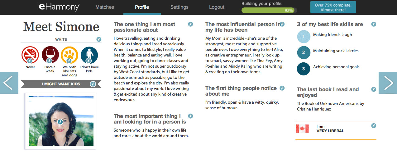
After I selected and paid for my membership, it was time to start building my profile page. One thing that I absolutely love about eHarmony: they have gorgeous profile pages! They’re incredibly modern, stylish and look more like well-designed infographics than online dating profile pages. The main page includes a giant landscape photo of your choosing and some very basic information: Name, age, occupation, education. The user can then scroll through the page horizontally. Each page of the profile includes different tidbits of information and is scattered with photos. If you’re a highly visual and design oriented person like I am, this is a welcome change and makes for a truly enjoyable browsing experience.
When it came time to add photos to my profile, eHarmony also does things a bit differently. Each photo that you upload must be approved before it’s posted and can’t include any inappropriate elements. As an FYI, the entire process from signing up, completing the questionnaire and adding basic info to my profile took about 45 minutes. People who aren’t very detail focused might find this time commitment frustrating; however, I appreciate how eHarmony encourages you to put a lot of thought and care into your profile. I also noticed that at the bottom of the page there is a cute “incognito” icon of a mask. Turn on the Incognito feature and you’re able to browse through profiles invisibly. Unlike some other dating sites I’ve tried where invisible browsing is only available at a premium, I like that this is a built in feature for eHarmony (whether I decide to use it or not).
Day 2 –
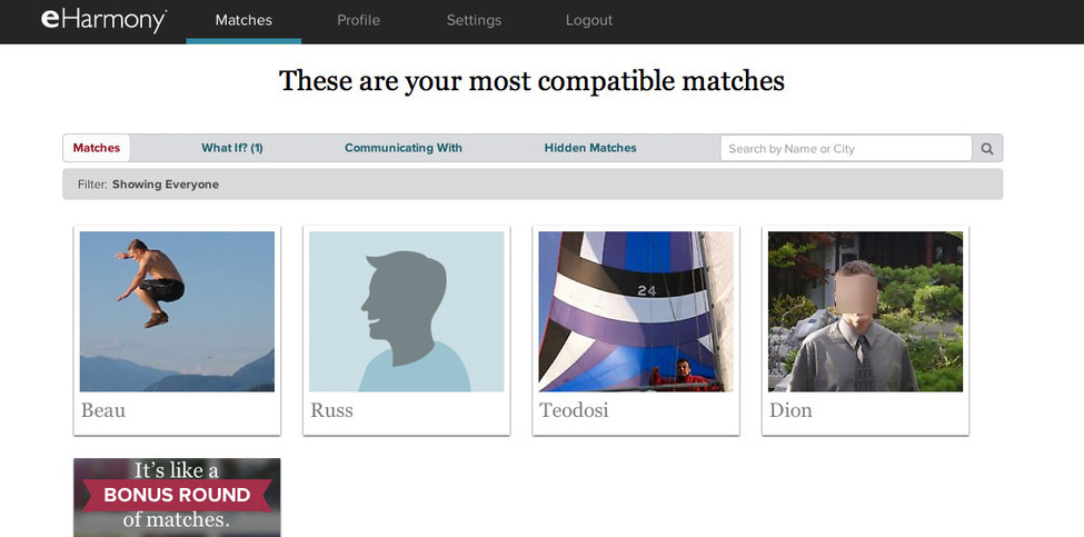
Despite only having filled out the bare minimum on my profile the day before, I woke up to an inbox full of messages, as well as a list of matches (these are delivered to your inbox daily). After I’d completed the rest of my profile and added a few more photos, I set about reviewing my matches. Every time you log into your eHarmony account, you’ll be able to access your Matches by clicking on the corresponding tab along the top navigation bar. Like the rest of the site, the Matches page is very well designed. You can see photos of all of your Matches and you can roll over their photo to get basic info about them (name and location) There’s also the option to send them a message.
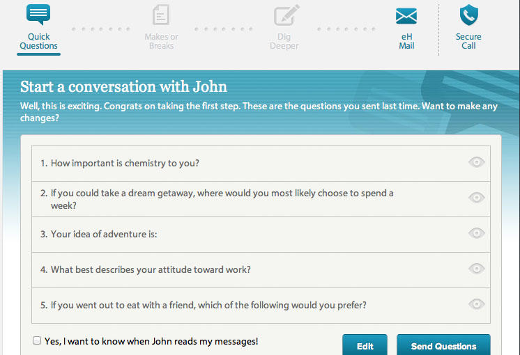
The messaging and communication process on eHarmony is unique. Members are encouraged to get to know their matches as much as possible before they move on to making direct contact. If you’re interested in a match, you’ll be prompted to select five questions from a list to send them. They’ll in turn answer your questions. If they’d like to keep the conversation going, they can send you questions in return. You’ll then have the option to send and receive each other’s “makes and breaks” (a list of attributes that you also select from a list). Although you can message someone directly right off the bat, the recipient will have to approve your request to message them. Users are encouraged to follow the designated chain of communication as much as possible.
You also have the option to send someone a “smile” as an ice-breaker.
Day 3 –
After making myself familiar with eHarmony’s communication system, I decided to test it out by messaging a few people. I quickly identified the pros and the cons of the system:
Pro: By making users send questions to their prospective dates, this greatly eliminates spammy, lame messages along the lines of “Hey. Sup?” that are prevalent in online dating. This is also a great system for people who are shy or tentative online daters. With the prepared questions, you can get to know the person without worrying about ever saying the wrong thing.
Con: Although I found it really interesting reading people’s answers at first, I found the “questions” system a bit repetitive after a while. You end up answering a lot of the same questions again and again for every person you’re in contact with. If you’re like me and are used to sending people messages right off the bat, this new way of communicating definitely takes some getting used to.
By the end of day three, I’d narrowed down my matches to 3 people I was interested in learning more about. I sent Bachelor #1 a set of questions, “Smiled” at bachelor #2 and decided to throw caution to the wind and direct message Bachelor #3.
Day 4 –
I logged into my account to find that Bachelor #1 had answered my questions and followed up by sending me his own set of questions. Hooray! The smile I sent to Bachelor #2 was not returned. I decided to escalate things and send a set of questions instead.
Bachelor #3 did not reply to my message. Did I come on too strong?
Days 5 -6
The past few days on eHarmony have been a flurry of activity. I’ve sent lots of questions, received a lot of questions and have even moved on to sharing “makes and breaks” with several people. I am still yet to hear back from Bachelor #3 that I messaged directly. Although my message was super brief and asked him what his favorite coffee spot was (he’d listed in his profile that like me, he’s a coffee addict), I feel like I have committed some big eHarmony faux pas – which seems silly if you ask me. Unfortunately,though, because I’ve skipped ahead and sent him eH mail, I can’t go back and send him ice breaker questions. D’oh!
I’ve yet to receive any direct messages from any of my matches; however there’s still time. I’ve also been experimenting with eHarmony’s “What If” feature which allows you to scroll through the profiles of singles who are slightly outside your match settings. I’ve actually discovered a couple of cool people this way that I am now in contact with!
Final Conclusions –
Overall, my experience on eHarmony has been very positive. I absolutely love the clean, modern, easy to navigate interface. Because of the way the site is set up in regards to communication, I find that it is decidedly less creepy than other dating sites. Both of these things are a huge win in my book.
However, with that said, I found the pace of the site a bit hard to get used to. When it comes to online dating, I like to send a few quick messages and then meet for a quick date to see if there is any offline chemistry. Although I really appreciate how involved eHarmony is, if you’re just looking to meet people and date, eHarmony’s style might take some getting used to. I think it’s an excellent site, just maybe not the perfect site for me at this point in my life.
My dream online dating site would be one that combines all of the design and functionality elements of eHarmony, but with more flexible communication options. I’ve yet to secure a date from eHarmony, but it’s only been a week. If anything, eHarmony has forced me to be patient and slow down the dating process – something that I’m hoping will pay off in the future!
Things I loved
- Clean, modern, well designed interface.
- Stylish profile pages that look like infographics.
- A complete lack of creepy messages – thanks to the communication system.
- In depth personality questionnaire that helps better understand who you are and what you’re looking for in a partner.
- Overall quality of matches: smart, educated and classy.
Things I’d change
- Survey and question burnout – the “questions” based messaging started to feel repetitive.
- Direct messaging is discouraged.
- There’s a lot of steps to go through in order to communicate with a match.
- Not that many matches in my area.
- It would be great to have the same stylish interface, but with an option for casual dating.

